

Organization Card
Slanted parallelogram card for an organization or school — pairs a clipped action photo with a foreground panel, large logo slot, italic display name, and optional school-color overrides.
Installation
npx shadcn@latest add @gameone/organization-cardRegistry dependencies: gameone-utils, fontawesome-kit, card
Usage
import { OrganizationCard } from "@/components/ui/organization-card"<OrganizationCard
name="Central High"
mascot="Royals"
image="/photos/central-high.jpg"
primaryColor="#4A61A1"
accentColor="#fbbf24"
/>Examples
Default
Hero photo on the left, brand foreground panel on the right with initials chip and display name. The accent edge stripe on the right is the only place the accent color appears in this layout, since the photo occupies the left half.
import { OrganizationCard } from "@/components/ui/organization-card"

export function OrganizationCardDefault() {
  return (
    <OrganizationCard
      name="Central High"
      mascot="Royals"
      image="/photos/central-high.jpg"
    />
  )
}
With school colors and logo
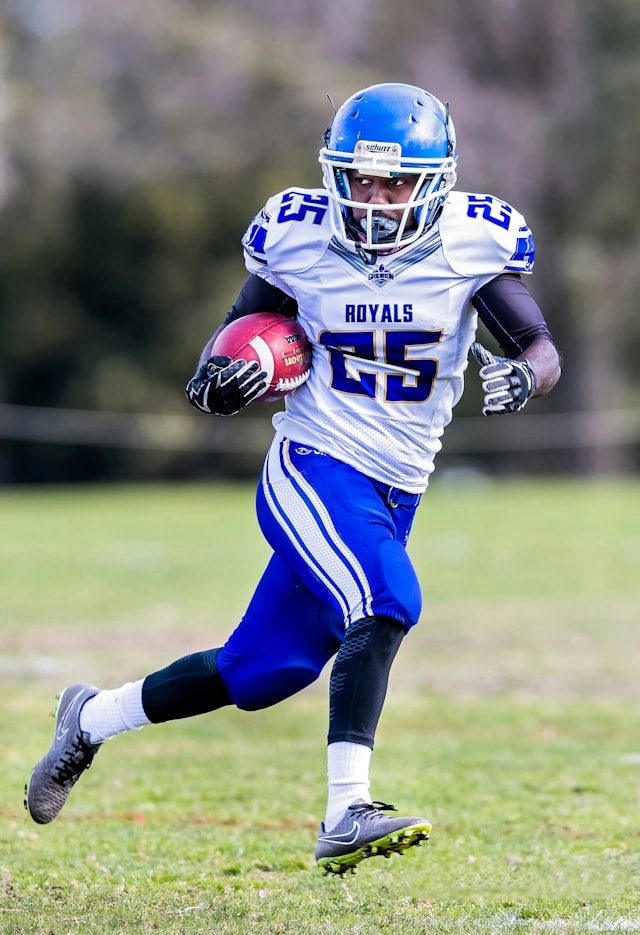
The full kit: hero photo, school crest in the top-right slot, primary color filling the right panel, and the accent color driving both the right-edge stripe and the forward arrow. The stripe is intentionally rendered only when a hero image is present — without it, the accent color would compete with the left fallback block (see the next example).

import { OrganizationCard } from "@/components/ui/organization-card"

export function OrganizationCardSchoolColors() {
  return (
    <OrganizationCard
      name="Central High"
      mascot="Royals"
      image="/photos/central-high.jpg"
      logo="/photos/central-high-crest.png"
      primaryColor="#4A61A1"
      accentColor="#fbbf24"
    />
  )
}
Light primary (auto contrast)
When a light primary color is supplied (here a saturated yellow), the card automatically switches the right-panel text to black. Contrast is computed via WCAG 2.1 relative luminance; whichever of black or white achieves the higher contrast ratio against the primary color wins. The initials chip and fallback arrow color follow the same rule, so the panel always remains legible regardless of the school color.
import { OrganizationCard } from "@/components/ui/organization-card"

export function OrganizationCardLightPrimary() {
  return (
    <OrganizationCard
      name="Westview Academy"
      mascot="Lions"
      image="/photos/westview.jpg"
      primaryColor="#fbbf24"
      accentColor="#4A61A1"
    />
  )
}
No image (color block)
When no photo is supplied, the left clipped region falls back to the accent color so the card still ships a strong brand cue. In this state the right-edge accent stripe is suppressed by design — the accent already lives prominently on the left, and adding the stripe would sandwich the primary panel between two bands of the same color.
import { OrganizationCard } from "@/components/ui/organization-card"

export function OrganizationCardNoImage() {
  return (
    <OrganizationCard
      name="Riverside Prep"
      mascot="Hawks"
      primaryColor="#0f766e"
      accentColor="#f97316"
    />
  )
}
Minimal (theme tokens only)
No image, no custom colors — falls back to the brand foreground panel and primary blue. Useful for a placeholder state.
import { OrganizationCard } from "@/components/ui/organization-card"

export function OrganizationCardMinimal() {
  return <OrganizationCard name="Central High" mascot="Royals" />
}